Index
Design and Build Quality
When we heard the Mi5s was in the works, we wrongly assumed it would be nothing more than a quick Mi5 refresh, using the same chassis. However, it is not.
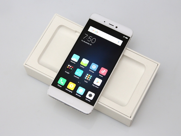
The Mi5s features a completely different unibody chassis. It looks like a slab of alloy broken up by antennae inlays, a lot like the iPhone. The Mi5 sports a totally different look, with a glass back slapped onto a metal frame. This should also make the Mi5s a bit more resilient in “bend tests” which weren’t too kind to the Mi5.
The footprint is roughly the same, but the Mi5s is a tad bigger than the Mi5, yet it feels smaller when you pick it up. Sound weird, so what’s the deal here? Both are small and light for this product category, but the Mi5s has a more curved design, which helps it “feel” smaller. In reality though, it’s almost identical to the Mi5 in terms of size. The Mi5s also employs 2.5D curved glass on the front panel, while the Mi5 sticks to flat glass. This also helps create the illusion of a smaller, curvier device.
The Mi5 measures 144.6 x 69.2 x 7.3mm and weighs a feather-light 129g, while the Mi5s tips the scales at 145g and measures 145.6 x 70.3 x 8.3mm. In other words, the Mi5s is a millimetre thicker, but thanks to its design, it doesn’t exactly feel bigger than the Mi5. Here's how it looks next to the 5.5-inch Redmi 3 Note Pro:

Aluminium is a lot easier to shape than glass, and it has another advantage in the aesthetics department – you get a few more colour options. Hence, the Mi5s is available in silver with a white facia, deep grey with a black front, as well as gold and rose gold for fashionistas.

Interestingly, the camera module does not protrude out the back. It’s flush to the surface, which is not surprising when Xiaomi uses small camera sensors, but it’s kind of unusual when it integrates a massive 1/2.3” sensor. This leads us to conclude that the optics aren’t as good as what you’d get on a Galaxy S, since there’s no distinctive camera hump at the back.

The downside to using an aluminium unibody design is less obvious – it sort of guarantees you can’t end up with a very original design. That’s why the Mi5s, Google Pixel, iPhone 7, and indeed all other phones built this way tend to look similar. Perhaps too similar?
The layout and ergonomics are Xiaomi standard. The power button and volume rocker are on the right-hand side.

The dual-SIM tray is on the left.

The top houses the 3.5mm audio port and secondary microphone. The IR blaster is notably absent – it’s been a staple of Xiaomi phones for years, but for some reason, it was dropped from the Mi5s.

The USB Type-C socket is at the bottom, along with the speaker and primary microphone, and that’s about it. Nothing spectacular to see here.

Thanks to the curved front glass, the Mi5s looks a bit swankier than its glass-clad predecessor, at least when it’s facing the right way up. The front also houses the ceramic home button that doubles as a fingerprint sensor.

There’s not much going on at the back. It’s just a slab of alloy, with a couple of antennae cut-outs, Mi logo, and the main camera.

Overall, the Mi5s is a good looking device with a premium feel, but it’s just not very original. This doesn’t mean Xiaomi copied Apple or Google (the Pixel was in development at about the same time). It merely means that designers don’t have too much freedom with such designs. The same is true of the Mi Note 2 we reviewed a few weeks ago - it looks pretty much like every other curved display phone out there (namely the duly departed Note 7).
The designers had their hands tied. There’s simply not a lot of room for innovation or originality when you commit to a particular approach. If you’re designing an all-glass curved phone, or an aluminium unibody device, you don’t exactly start with a clean sheet of paper and you don’t get to think outside the box.
Don't get us wrong: The Mi5s is a gorgeous piece of kit, but it's not special or original.

